Table of Contents
fmriqasheet
Motivation
Please refer to the information given at fmriquality. This is an auxiliary function split out of fmriquality to allow being called separately.
Function reference ('help fmriqasheet')
  fmriqasheet  - create figure with output of fmriquality

  FORMAT:       [qs = ] fmriqasheet(q)

  Input fields:

        q           return structure from fmriquality call

  Output fields:

        qs          figure handle (1x1 double)
Usage
Given that one has already called the fmriquality function, the usage is straight forward:
- fmriqasheet_example.m
% calling fmriqasheet with variable qas
fmriqasheet(qas);
Interpreting the output
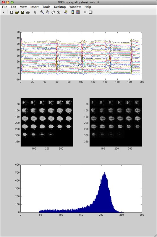
There are two cases. First, if fmriquality was called without motion parameters detection the output looks (as an example) like this:
The top plot graph shows one timecourse per slice (only voxels detected as foreground/brain). The left slice-mosaic image shows the global signal-to-noise (SNR, mean image, shows where in the brain data is distorted or signal dropouts occurred), the right slice-mosaic image shows the temporal SNR (shows where in the brain temporal noise components are not equally distributed, for instance noise spikes stemming from k-space reconstruction problems). The bottom histogram shows the global signal-to-noise histogram (useful to see if one particular run/subject falls within the distribution of the entire dataset).
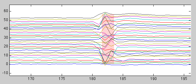
With the standard Matlab figure toolbar enabled, it is very convenient to zoom in on those parts of the timecourse (top plot) that show distortions (which might require additional investigation and/or allows the user to note those volumes for later discarding):
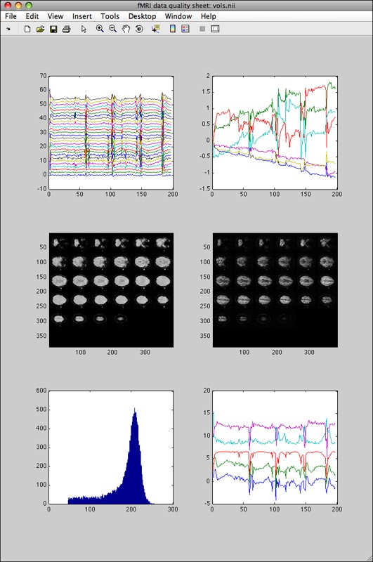
Second, if fmriquality was called with motion parameters detection the output looks like this:
Instead of a single graph in the top row, the two graphs show the slice-wise time courses (left) and the detected motion parameters (right). Next to the (smaller formatted) histogram in the bottom row, the “quality assessment” time-courses are displayed on the right (they show where anything unusual happened in one of the QA measures over time).


